Category: Design
Why the Most Powerful Colors in a Space Are the Ones You Almost Miss
When we think about color in interiors, we often think in obvious terms.
A bold wall.
A contrasting palette.
A statement shade that defines the space.
But the colors that truly shape how a space feels are rarely the ones we notice first.
They sit quietly in the background.
They don’t demand attention.
They don’t try to stand out.
And yet, they influence everything.
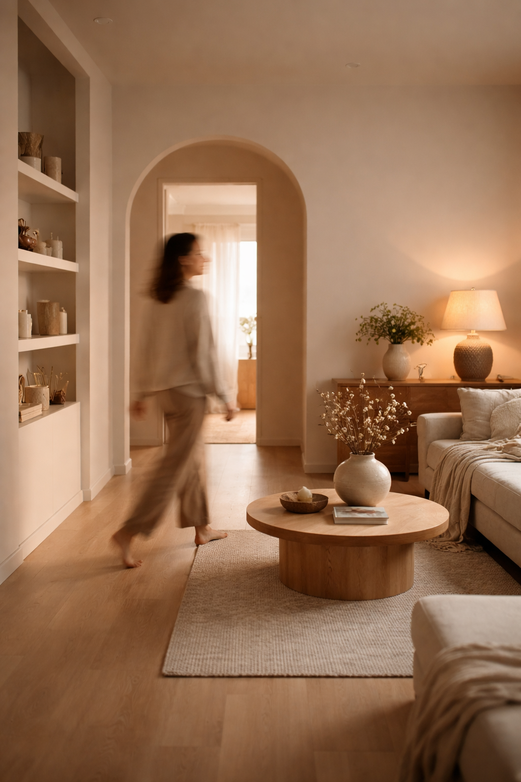
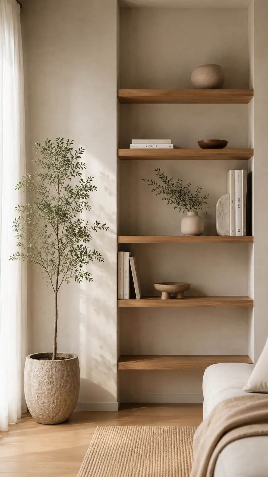
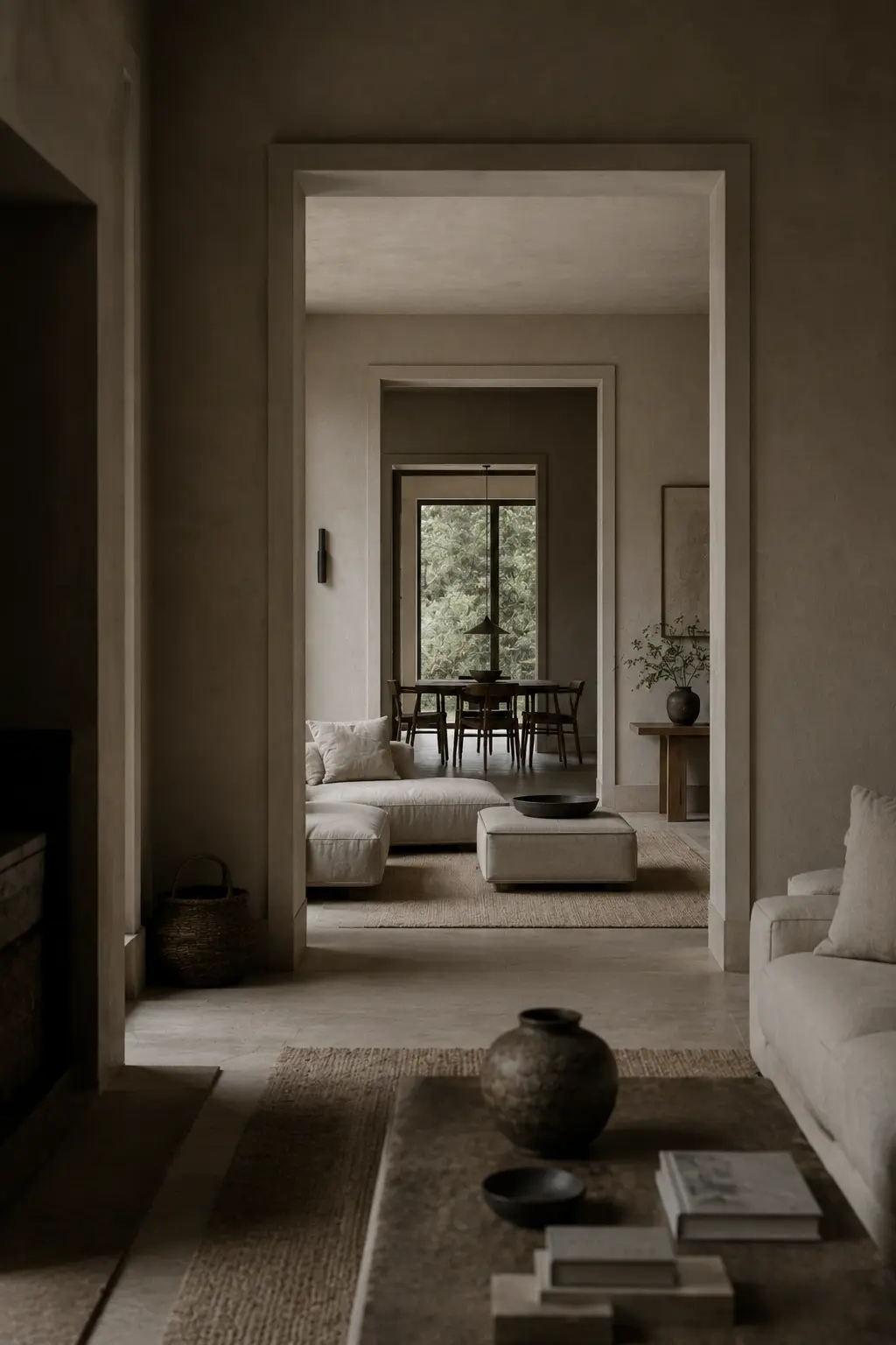
A slightly warm white instead of a stark one.
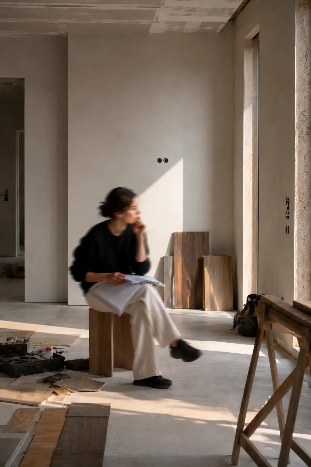
A muted undertone in the flooring that softens the entire room.
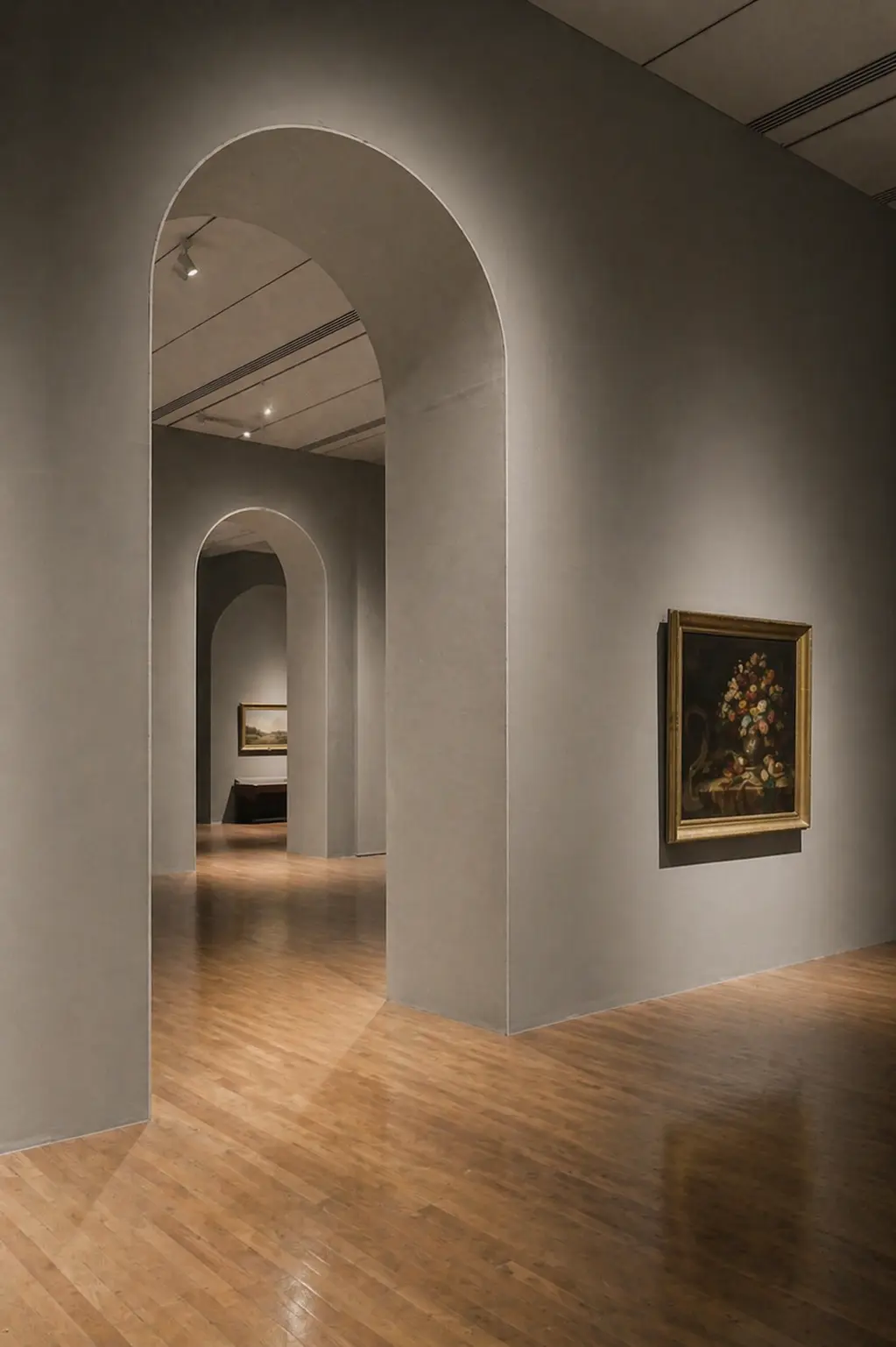
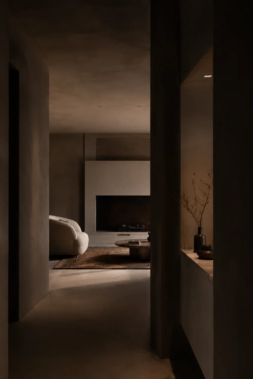
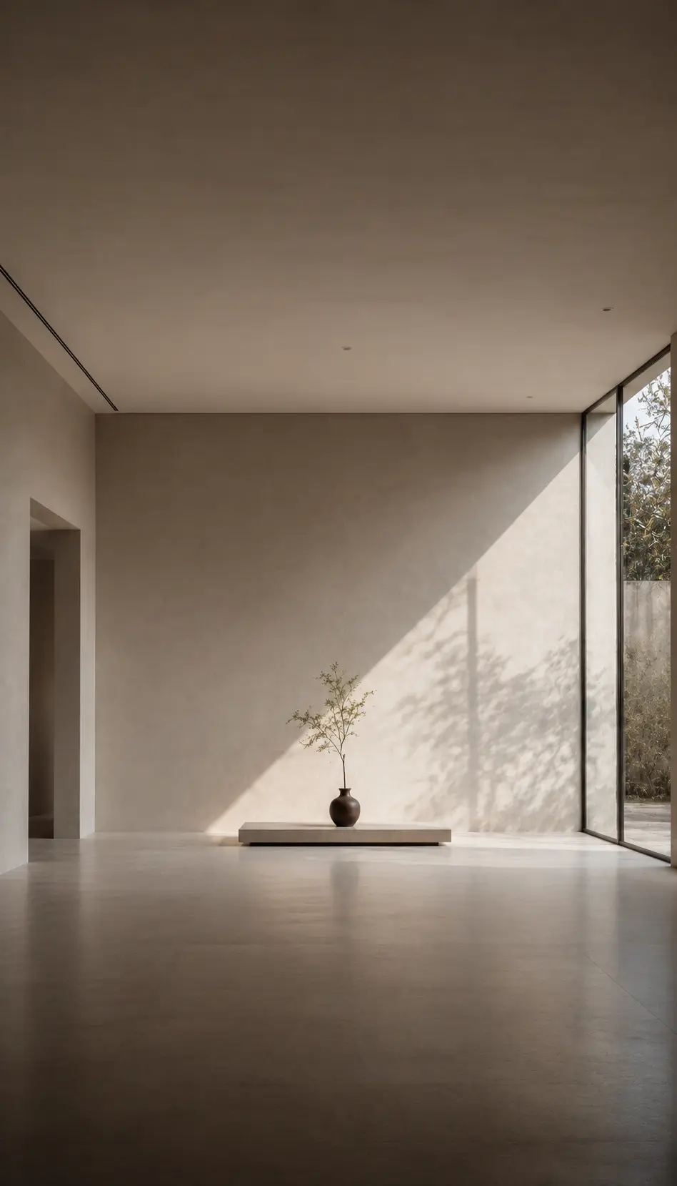
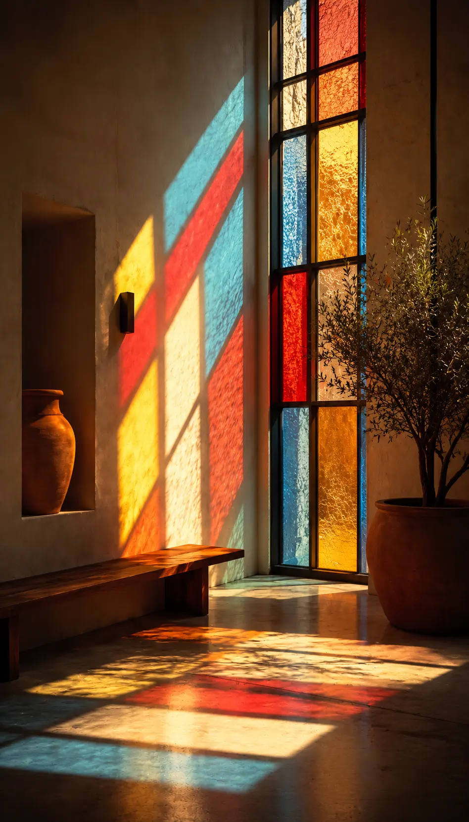
A shadow tone that changes subtly as light moves through the day.
These are not colors you point at.
These are colors you feel.
Most spaces go wrong not because of wrong colors —
but because of colors that are too certain of themselves.
Too defined.
Too fixed.
Too loud in their presence.
But when color is allowed to stay slightly undefined —
when it sits between tones, between warmth and coolness —
it creates depth without effort.
It allows the space to breathe.
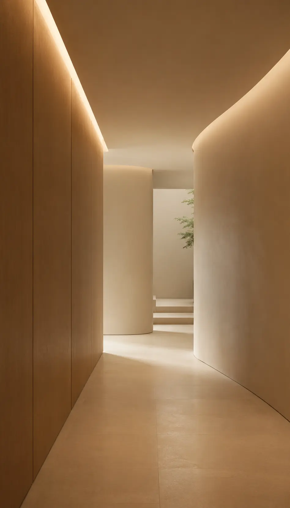
It adapts to light.
It changes with time.
It never feels static.
And that’s where color becomes more than visual.
It becomes atmospheric.
So instead of asking, “What color should this be?”
I often think “What color should this not fully become?”
Because sometimes, the most powerful color
is the one that refuses to be fully seen.
Related Articles
More about Design